New look, new name(ish!)
This week, I’ve upgraded my logo and changed my business name, and now am taking a brief look back at my previous logo designs and how my name has shifted to reflect the growth in my practice! You’ll still be seeing the old logo around on old posts and physical bits of kit whilst I’m in the process of gradually swapping things out, but digitally you should now notice that everything has been updated to reflect the change.
When I first started this business in 2019, I began only with dog walking. So, to keep things nice and simple, I chose to call my business ‘Toby Duncan Dog Walking’, and let the name speak for itself. It wasn’t until 2021 that I really began to get into the swing of things and put together my social media pages, this website, and of course as part of that, some proper branding. My first ever logo design was very illustrative and fun, and although it didn’t last very long, I still have a soft spot for the vibe it gives off!
My very first ‘logo’ design, illustrated by myself in 2021
Still, it wasn’t long before I felt the need to level up my design and create a logo that was a little more graphic, and could be used for more than just business cards. I ended up using software provided by Vistaprint to generate my second logo, featuring the stock illustrated dog seen below. This was also the point at which I was able to really create a ‘brand’ in terms of deciding on consistent fonts, colours, and styles to use across my various pages and physical material.
A little later on, I began to offer dog training as well as walking, and so tacked that straight onto the end of my name, becoming ‘Toby Duncan Dog Walking & Training’. It was important to me, at that time especially, to really showcase this new skillset and service that I was able to provide. I was, and still am, very proud of being a Trainer as well as a Walker, and wanted this to be one of the things that people would know about me right off the bat!
My previous logo design and long-form name, made with Vistaprint
It’s been about a year now since I started my journey as a Trainer, and so around the same amount of time since I last updated my logo. Now, the time has come again, (hopefully for the final time), to adjust my branding with a logo and name overhaul. My colours and fonts remain the same, which will be good to maintain some consistency, but my business name and logo illustration have upgraded to match where I’m at now.
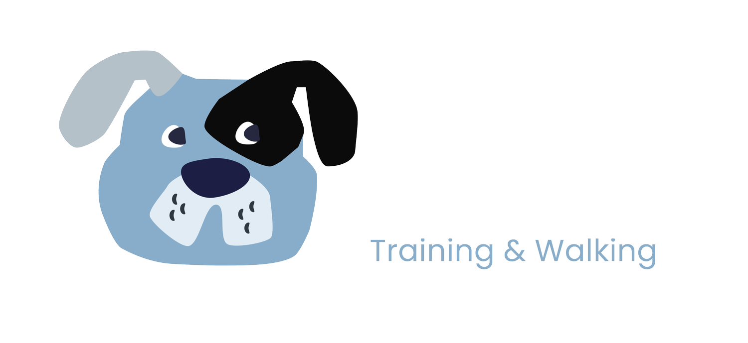
I’ve chosen to adopt the same name that has been my web domain as well as my username on both Instagram and Facebook for the last couple of years - ‘Toby Duncan Dogs’, and have created my own vector illustration to provide a new doggy face alongside this! My services are now listed in a tagline underneath the main business name, which I think works a lot better all round. I don’t necessarily want to emphasise one over the other, and have only chosen to swap ‘training’ and ‘walking’ round in this tagline because training is the part of my business that I’m now actively trying to grow. The walking, I find, often ends up advertising itself, as I’m out and about meeting people, making connections, and picking up new clients all the time!
My current logo and name!
And there it is, that’s pretty much the whole story behind my design journey for the business now known as Toby Duncan Dogs! There’s still some room for planned grown in there, with the option to add new services to the tagline, as well as hopefully the IMDT letters to the name following successful accreditation. Still, I’m happy with this new iteration and am definitely not looking to make any more major changes any time soon!


